Thursday, December 31, 2015

Goodbye 2015

It's been a while since I've posted anything.  I have been overworked with a project the last couple of weeks involving some loans that are part of litigation and with the holidays in full swing I haven't really had any time to group my thoughts and put them down on paper.  I figured I would give a broad brushstroke of what's new in my world.
 
So, I saw the new Star Wars film four times in less than two weeks.  Didn't really mean to.  It sort of just snowballed on me.  That is not to say it isn't worth seeing four times, because it is.  It was really good and as if the first line of the film is referencing what had come a little more than a decade before, it begins to make things right.  I loved all the new characters and seeing the old ones in a new adventure was not just nostalgic, but also a little emotional (or at least as close as I can get to what humans consider to be emotional).
 
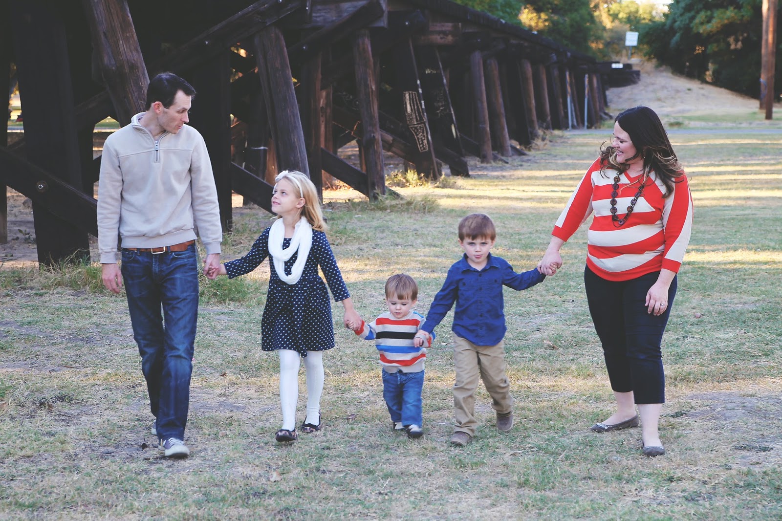
Christmas went pretty well.  Jack got a little BB-8 (new Star Wars character) remote that he calls his new best friend.  That was the gift of the year for our family, so I am glad it went over well with Jack.  Unfortunately Joanna didn't love my gift to her as much.  I got her a crockpot with the ability to lock the lid (which is what she specifically asked for), but because it didn't have a few additional bells and whistles it got returned and traded for a deep dish cooker or pot fry pan or steam-baked something-or-other.  I don't know.  She doesn't understand time travel.  I don't understand the differences in a pot, a pan, and a wok.
 
Television/movie recommendation of the week (or maybe month; I don't usually do these) is a Netflix documentary called Making a Murderer.  I don't want to give many details because the 10-part series pretty much covers everything you need to know, but it details a man named Steven Avery and his involvement in Wisconsin crimes that took place in the 1980s and 2000s.  It was a gripping series that I binge watched in a few days time.  Don't research his name or what the documentary is about.  I promise it will be worth the 10 hours.  Just watch it.
 
I guess that is most of it.  Everyone have a safe and happy New Year's Eve.  Don't get beat down by the mediocre music heard on all the telecasts tonight and try to be with someone you love at midnight.  See you in 2016.

Friday, November 13, 2015

You Know Who I Want To Be The Next President?

Although we are a year away from the general election to find a replacement for President Obama, the American people have had to put up with a lot of debates, questions, stories, and pointless headlines regarding the potential candidates.  The most recent question that has been making the rounds, and started with Jeb Bush, is if the candidate could travel back in time would he/she kill baby Hitler.  Bush provided a candid response of, "Hell yeah, I would," and "You gotta step up, man."  This has led to reporters asking other presidential hopefuls the same question, which seems like a scene right out of Mike Judge's Idiocracy.
 
After careful consideration and countless hours of contemplation on the topic (a total of about 90 seconds of rational thought and 10 minutes of typing), I've decided the presidential nominee who would get my vote is the one who responds to the baby Hitler question with this: "The idea of killing baby Hitler falls under the grandfather paradox of time travel.  While time seems to be linear and accessing the past or future is a frequent avenue for science-fiction literary trope, it probably in reality is another dimension in the fourth plane of existence.  Therefore your scenario is moot and not worth consideration.  Let's move on to foreign policy, shall we."
 
That guy or girl is the candidate for me.

Thursday, November 12, 2015

Quick Question

Who was the Hitler before Hitler?  What I mean by that is when people in 1930 needed to drive home a point on Internet message boards about how atrocious a person was being, at that point in history they couldn't compare them to Hitler or the Nazis.  So, who did we use as the villain of all villains prior to Hitler's reign of terror?

Monday, November 09, 2015

A Brief Review Of 'Spectre'

The wait is over and my initial fears and expectations have been replaced by reflection and critique.  Spectre was an enjoyable film that didn't quite live up to what I was hoping for, but it was still a satisfactory entry into the 007 film series.  Because of the great success and astounding praise I have heaped on the previous Sam Mendes-directed Bond picture, Skyfall, I was hoping this one would be just as good, if not better.  While there certainly were elements that exceeded Skyfall, as well as other Bond movies of the past 53 years, overall it didn't quite reach that level of quality I had formulated in my mind.
 
A new list of rankings will have to be put together, which will break down more thoroughly what I liked and didn't like about the movie, but after only two viewings this past weekend, Spectre is most likely going to land just outside the top ten for me.
 
Some highlights of the movie include the pre-title sequence in Mexico City, and especially the opening tracking shot that is reminiscent of what Birdman did for an entire two hours, the henchman Mr. Hinx, the overall atmosphere of a classic Bond adventure from the 60s, as well as the performances of Daniel Craig and Léa Seydoux.

Wednesday, November 04, 2015

The Spectre Just Got Real

It's official.  It's really happening.  It's really real.  Tickets have been purchased for my viewings of the upcoming James Bond film, Spectre.
 
You didn't read that wrong.  It does say tickets and viewings; as in multiple tickets and multiple viewings.  I'll be attending a late Thursday showing with my friend Danny and then follow that up with an encore the next night with my wife and a group of friends.  Most likely it won't end there either.  I'll probably see it at least once more in a few weeks after the hype and personal elation has died down a bit.
 
Things finally sank in for me yesterday that my expectations might not be fulfilled with this movie.  Normally I don't let critical reviews or overseas box office receipts sway my excitement level (at least not until the night of when I'm standing in line with the velvet rope being the final barrier to me and a new Bond adventure; at that point I'm like Riley from Inside Out with fear in total control of the console), and you'd think that having Sam Mendes at the helm for his second 007 picture would soothe me after the great success of Skyfall.  However, for some reason I'm already freaking out about whether I am going to be disappointed or not.
 
While critics have mostly been generous with their praises, it seems they believe Spectre isn't quite as good as Skyfall.  The general consensus among fans is that there is no consensus.  I've seen it ranked as high as the second best of all time and as low as the second worst.  Some have it near the same spot as Skyfall while others consider it to be nothing like the quality (whether good or bad) of the previous Mendes movie.  These two things alone aren't the reasons I have started overthinking the new film and been overcome with pre-show jitters.
 
What ultimately got me to start questioning the upcoming film is a ranking I found on a fan message board that included Spectre at number 17 on this individual's list.  Okay, big deal.  So one person had it in the bottom third of the series.  Well, what makes this single list stand out more than the rest is where his other films fall.  His rankings are eerily similar to my own.  We agree on both the top two films of the series (From Russia with Love and Goldfinger) and are dead on with another two.  We differ only one spot on five other films and another two are separated by two spots.  It would seem this person has about the same level of taste when it comes to James Bond movies, so finding his or her ranking of Spectre at 17 is what has me worried.

A new comic was released today featuring James Bond titled VARGR.  It is the first original 007 comic book series to be produced in 20 years, so this is an exciting day in itself.  Hopefully it will placate me through the next 24 hours or so until I can get to the IMAX theater in Dallas for the first of several Spectre viewings.

By early Friday morning I will know for sure whether I liked Spectre or not and by about 11 that night I will have a great idea of where it falls in my overall list of all the films.  My hope is to have updated rankings for all aspects of the 007 film series, from movie and music to characters and title sequences, by early next week.

Thursday, October 22, 2015

Family Photos

This past weekend the Cook family went to Trinity Park in Fort Worth to have some pictures taken in order to get our Christmas card in order.  We received a bunch of the photos from that session and I thought I would share my lovely family with everyone.  Sorry, but this will be the equivalent of me taking out my wallet and showing you pictures of my wife and kids.  I know it is boring, but it is something you do as an adoring father and husband.


The picture directly above is my favorite of the bunch.  It will be the newest to be framed and placed on my desk at work for all the women in my cubicle to coo over.

Monday, October 05, 2015

Volleyball : Soccer :: Hawaiian Vacation : Biblical Plague

Having my own personal blog, you'd think I would spend a little more time talking about the great things happening in my life, which includes the joy my wife and kids bring about.  Unfortunately I am selfish and talk only movies.  Well, for today at least that changes.
 
Last weekend was the start of Emery's newest sporting venture: volleyball.  She has done gymnastics for a long time, but that is just a hobby and not done in any competitive sort of way.  She has also dabbled in soccer.  If you ask me, she attempted that sport one (probably two) too many times (she played twice).
 
Based on the limited practice I had done with Emery, I wasn't sure what to expect on Saturday.  Surely a court full of 8-year-old girls trying to bump, set, and spike a ball back and forth wouldn't end well, especially after two seasons of seeing 5- and 6-year-old girls kick a ball back and forth.  Kicking is WAY easier than the skills that volleyball requires and introductory soccer is a disaster.  However, I am happy to report that it wasn't the crotch kick that I thought it would end up being.  Especially since the only part of the bump, set, spike combination that is utilized is bumping.
 
The hour we were there went by quickly and I am proud to brag on Emery that she had one of the best serves on the team.  The serve line is moved closer to the net to make things easier, but about half the girls had trouble serving the ball over cleanly.  Yet, Emery's lone serve was well executed.  Since her team wasn't able to handle the opponent's volley, she only got to serve once in three games, but I expect that to change as she plays more.
 
Other than her serving, we will have to work on her play when the ball is being volleyed back and forth.  It isn't that she is bad at bumping the ball, but she is just not very aggressive.  We will be out of town next weekend, so there is a two-week layoff until the next game.  During that time I am going to work with Emery to get her to hustle a little more to the ball when it is coming in her direction.
 
If the first game was the worst of the season, which is usually the case when your kid is learning the fundamentals of a new game, I am looking forward to what is to come.  While not the star of the team, Emery is certainly going to be serviceable and that always makes things more enjoyable for everyone involved.

Monday, September 28, 2015

James Bond U.S. Poster Rankings: No. 1

It's been a long ride.  24 posters in all.  Most are probably glad to see this final post, not because they are excited for the reveal of my favorite domestic one-sheet poster from the James Bond film series, but instead because they want me to move on to something new.  Well, like I've said in several posts before this one, this is my blog and I'll post what I'm interested in, and what I am interested in is movies, especially 007 movies when a new one is soon to be released.
 
So without further ado, let's see what tops the chart of my favorite artwork used in United States theaters to promote a James Bond film.
 
 
1. Casino Royale
You might look at the above poster and say, "Really, that's the best of the lot?"  I agree.  Compared to other posters in this series it is very light on action and plot details.  It provides very little in the way of teasing the viewer and is probably not the most creative in design or marketing.  So what exactly is it that makes me adore this poster so much that I would frame and hang it in my living room?  The answer to that question is one word: subtlety.  I could probably add another word to why I like this poster and that would be elegance.
 
There are only two people found in the frame, so there really isn't a whole lot to break down as to what I am talking about.  Let's start with the subtlety of the poster.  The major draw of the 007 film series is the action, women, cars, locations, explosions, and stunts.  These films have created an iconic hero who is cool under pressure and always saves the day.  So without having any explosions on the page, Bond fighting a henchman drawn in a corner of the canvas, or a car flying across the page with a rocket in pursuit, how do you express that level of excitement we expect from these films?  In the case of the Casino Royale poster you have our hero brandishing a silenced Walther PPK while sporting a disheveled appearance with the tuxedo shirt unbuttoned and loose bowtie around his neck.  By giving Daniel Craig's incarnation of Bond a more tousled appearance, it gives the viewer an idea that his version of 007 would be one that gets his hands dirtier than his predecessors.
 
Timothy Dalton's take on the character was also one that was more down-to-earth and hardened, which could be seen in his film posters as well.  Here is one from License to Kill with the same unbuttoned look as Craig.
 
 
Along with the characteristics of Bond movies listed above, this film series is also one filled with sophistication.  Bond eats the best food, drinks the most expensive wines, stays in the most luxurious hotels, and sports the most chic outfits.  While his tuxedo is not properly fitted with the bowtie undone and shirt unbuttoned, he is still in the tux.  He is also walking away from the Casino Royale, which is a name that signifies class and refinement.  But what really fits the bill of elegance is Vesper's dress.  The low-cut, flowing gown is an outstanding costume and has become one of the most memorable outfits of the series, trailing behind only Bond's tuxedo and Honey Rider's bikini from Dr. No.
 
While the poster alone does a great job of showing off Eva Green's beautiful figure, it doesn't truly do the dress justice as when she is seen entering the poker room.  At that point even Bond's draw drops at how gorgeous she is.
 
It is because of the simplicity of Bond's aggressive manner and Vesper's stylish formal wear that I love what the artist has conveyed in this poster.  It sums up so much of what the 007 movies are about in two simple images.

Friday, September 25, 2015

'Writing's on the Wall' Released; A Mixed Bag

The theme song to the upcoming James Bond film Spectre was released today.  There are elements I really like about "Writing's on the Wall" and then there are some other aspect's I'm a little underwhelmed by, but overall I like the song.
 
The orchestration is top notch.  If it were an instrumental like "The James Bond Theme" from Dr. No or the theme to On Her Majesty's Secret Service it would likely be rated much higher.  I feel the song will fit in nicely with the film's score.
 
However, the lyrics and Sam Smith's singing is not as well received.  It should be noted that for the most part I don't enjoy the love ballads when it comes to a James Bond theme song.  The exception to that is "Nobody Does it Better" from The Spy Who Loved Me.  Smith doesn't ever really belt out the lyrics, which I'm not in love with in the first place, and when it finally gets to the end of the song and you think he is going to pull a Shirley Bassey and end on a powerful note, it somewhat sputters out.  He never really reaches the crescendo I was expecting.
 
Overall I feel the song is going to grow on me, unlike "Another Way to Die" from Quantum of Solace, which started off well liked and slowly moved back the more times I listened.  My initial reaction would be that among the Daniel Craig-era themes, it is behind "Skyfall" and ahead of "You Know My Name," which is the tune from Casino Royale.

Wednesday, September 23, 2015

James Bond U.S. Poster Rankings: No. 2

Forgoing all action or possible plot teases, the marketing team on the next James Bond poster found in the United States in 1981 was purely to rev up the male libido with sex appeal.
 
 
2. For Your Eyes Only
Roger Moore can be found centered in the background, posed in a gun-wielding stance.  Yet, the star of the entire film, the 12th of a popular series that had been running for nearly two decades, is probably not the first or even the second thing you notice about the artwork.  What most eyes fall toward initially are the bare legs of a fit woman in high heels and the bare minimum of a swimsuit covering her backside.  Once your pulse returns back to normal and your eyes begin to wander the page, you likely notice the weapon of choice for our mystery woman.  The crossbow with its deadly bolt, or arrow, cocked at the ready.  And then finally you notice the remaining image of British superspy James Bond, surrounded by those provocative limbs.
 
And that is it.  No explosions.  No action sequences from the film transposed to paper.  Nothing else giving the slightest idea of what the film could be about.  It is simply a tag line at the top, Bond and the dangerous mystery woman in the middle, and the film's credits at the bottom.  Even the color scheme is very plain.  The artist(s) was going for one thing and one thing only: sensuousness and a mysterious danger.
 
While the idea of Bond surrounded by bare legs was found in nearly all the posters around the globe, they did add some action to the frame for posters in other countries, such as this one from Germany.
 
 
Although this is my second favorite poster used in the James Bond film series, I doubt I will ever seek out a copy to frame and hang in my house as my wife probably wouldn't appreciate having this artwork in our living room for the grandparents and friends to view while spending time at the Cook home.  However, the final poster to top my list that will be revealed soon is in my living room currently and will probably stay there for quite some time.  Until then ...

Monday, September 21, 2015

James Bond U.S. Poster Rankings: No. 3

Based on the ranking alone, you might think that the next film in this list of the greatest domestic one-sheet posters for the James Bond series would be one of my favorites.  Yet, the opposite couldn't be more true.
 
 
3. A View to a Kill
Roger Moore was 57 years old when A View to a Kill hit theaters, and his age was certainly showing.  Moore hadn't been the most athletic actor to play 007, his stuntmen doing much of the work during action scenes throughout the series and when a dangerous situation required Moore to be viewed on camera, a green-screen was utilized much of the time.  And if that weren't enough, having the 57-year-old bed former Charlie's Angels starlet Tanya Roberts, who was 29 when the film was released but easily looked younger, aged Moore considerably.  The 28-year gap between co-stars was such a difference that it felt like Moore wasn't just old enough to be Roberts' father, but he could have passed for her grandfather.
 
Despite the age difference and the light-heartedness that Moore had brought to the series during his time as James Bond, the image seen in the one-sheet poster above does its job in creating anxiety and conjuring a sense of thrill in the viewer.  What are Bond and his girl doing on the Golden Gate Bridge?  How is our hero able to hold on to the damsel, shoot at the villain in his blimp, and balance himself atop one of America's most beloved monuments to modern architecture?
 
Not only is the idea of a battle between hero and villain on the suspension ropes of the Golden Gate Bridge a thrill in itself, but the angle at which the artist has drawn creates a bit of vertigo for the viewer.  It is an excellent piece of marketing design that teases excitement and provides the perfect amount of intrigue for the upcoming movie, which is exactly what you want with a poster.
 
The Golden Gate Bridge theme was used in most of the marketing materials for A View to a Kill.  The only other action set piece that was promoted was Bond and Mayday at the Eiffel Tower.
 
 
As you can see, this one-sheet advance poster found in U.S. theaters is quite similar to the Golden Gate Bridge artwork, except that Paris is the city in the background, obviously.  However, the sense of a fear of heights isn't quite accomplished with this poster like it is with the one at the top.

Wednesday, September 16, 2015

James Bond U.S. Poster Rankings: No. 4

I've finally reached the point where my ranking of the domestic marketing posters for every James Bond film cheats a little bit.  The reason I say that the next poster in my ranking is cheating is because there isn't an official one-sheet poster for United States theaters yet for the upcoming Spectre.  Everything released thus far has been a teaser poster.
 
 
4. Spectre
The above poster is the most recent release of promotional artwork for Craig's fourth outing as 007.  It is the first to show something more than just a single image or person, as you will see below.  Craig is obviously the focal point of the frame in his usual well-fitting suit and Walther PPK at the ready.  Bond girl Lea Seydoux stands behind Craig in an elegant, full-length silver dress.  Both actors have a serious stare as they look directly at the viewer.
 
The final element of the poster is what is in the background.  It is a masked man who is taking part in a Mexican Day of the Dead parade, which will be the setting of the pre-title action sequence.  It is a haunting image and, like the cinematography in Skyfall of Bond approaching the Macau casino surrounded by lanterns on the water, should be one of the visual highlights of the film that audience members take away from the film long after the credits roll.
 
 
This is a variation of the poster at the top.  It changes Craig's outfit to a white tuxedo with a red carnation, which is a throwback to 1963's Goldfinger, starring Sean Connery.  Bond also takes this photograph less seriously as he smirks at the camera and crosses his arms, brandishing a silencer on his Walther PPK.  The other alteration to this poster is the man in the Day of the Dead mask being fainter in the background and there is less color used.  Seydoux doesn't change at all between the two images.
 
There have been two other posters released since the official press conference for Spectre.
 
 
This one was used at the title announcement and looks rather innocuous, but upon further inspection is actually rather interesting.  The shattered glass from a bullet at first seems to be just that, a normal entry hole from a bullet that caused some cracking.  However, if you look a little closer you can see eight cracks that travel downward from the hole.  The entire thing creates the image of an octopus, which is similar to this:
 
 
This is the original symbol for Bond's arch nemesis organization, SPECTRE.  The ring could be found on the fingers of numerous villains and henchmen/women Bond faced during Connery's days as Bond.  The ring will be used in the newest movie, but modernized to fit the universe Craig has created since rebooting the series in 2006's Casino Royale.
 
As you can see, the ring's logo is similar to what is created in the shards of glass on the title announcement poster.  Another connection to the Bond franchise is the fact that the bullet hole is formed in glass.  That may not seem rather important, but, without giving any spoilers away, there is a pivotal scene in On Her Majesty's Secret Service that contains a bullet hole in glass.
 
I absolutely love the poster from the title announcement press conference.  In fact, it has been my desktop image since it was released, which has probably been a little creepy for my co-workers who have seen a bullet hole on my computer screen for several months now.
 
The final teaser poster for Spectre was this.
 
 
Compared to the title announcement poster and the most recent image of Craig and Seydoux, this one is dull and lifeless.  The only real point of interest is that the outfit Craig has on is a reference to Roger Moore's film Live and Let Die.  But other than that, there really isn't much more to say about this poster.
 
Since I don't have an official theatrical one-sheet poster to rate, I will have to go with the latest teaser poster, and it comes in at number four.

Monday, September 14, 2015

James Bond U.S. Poster Rankings: No. 5

We enter the top five of my favorite posters found in United States theaters for the James Bond film series, and although I was only two years old when the movie was made and have no recollection of what really took place, I imagine it was quite a brouhaha when the marketing material was released for this 007 adventure.
 
 
5. Octopussy
The artwork for Roger Moore's sixth outing as James Bond does an excellent job of filling up the frame with the necessary action sequences that would be found in the film, without going too far overboard.  The only criticism I really have with the artistry on the Octopussy poster is the group in the bottom left that features the title character's minions taking on a bevy of henchmen.  The center character, who we would find out during the movie is named Magda, looks like she is lazily holding one man in a chokehold while stretching for ballet as another guy runs into her foot.  Maybe it's me, but she just doesn't come across as menacing or dangerous, which is quite opposite of everything else going on across the glossy page.
 
But enough about the bad.  Looking at what is done well, the picture of Bond in a jet being chased by a missile and the small artwork at the top left showing Bond and a henchman on top of a plane are quite thrilling.  Yet, it is Bond girl Maud Adams hiding behind Roger Moore in his debonair gun pose that really sells me on this poster.  There is something that I can't quite put words to that has me enthralled by her eight arms wrapping around Roger.  Some hands have a deadly purpose while others are being used to titillate our hero.  It is a captivating image that requires multiple viewings to make sure that nothing is being missed the first time.
 
The image of Octopussy and Bond together was used in most of the posters around the globe, so there isn't anything better, or worse really.  I scoured the Internet to try and find some sort of better artwork, but Octopussy seems to have not really inspired anyone to be at their creative best.  There is a lot of themes set around the octopus, obviously.  What I was really surprised by was that someone didn't come up with something based around a Faberge egg, as that is a crucial plot device used in the film.

Thursday, September 10, 2015

James Bond U.S. Poster Rankings: No. 6

Something you might have noticed by now with posters from the 1960s is that images were framed to give the viewer an idea of the film's story or they were done so to coincide with a tagline.  The latter is certainly the case for the next poster that was found in United States theaters in 1965.
 
 
6. Thunderball
The tagline for Thunderball, "Look Up! Look Down! Look Out!," provided the perfect opportunity for the marketing department to select two action sequences from the movie and highlight them on the domestic poster alongside the customary shot of our hero surrounded by scantily clad women.  And don't forget to alter the words to include Bond's signature number, 007.
 
While the poster for Thunderball seems somewhat generic and repeated after 23 films, do keep in mind it was only the fourth picture in the series.  Also, the artwork that was chosen for the poster, which was also used in several marketing materials around the globe, is actually pretty exciting and motivates me to want to watch the film, even after seeing it as many times as I have.  The jet pack itself makes this movie worth it.
 
Like I mentioned in the previous paragraph, the marketing campaign for all domestic and international advertising was similar, so there really isn't anything much better than the U.S. one-sheet poster.  What that means is we get to look at some other type of artwork for Thunderball.
 
 
This is some fan-made artwork.  It certainly differs from the official poster in that it is much more subtle in what it puts on the page.  It is similar to posters for films like Alien, Jaws, and The Godfather that provide only one or two images that teases the viewer.  The tagline "The oceans are no longer safe" is a little lame, but they do retain the original "The biggest Bond of all," which at the time it was.  Although their choice of trying to create an original tagline is a little underwhelming, the faint image of the eye-patched villain and a stealth bomber sitting on an ocean floor is certainly exciting and would pique a person's interest in that upcoming release.
 
 
Finally, we have something that isn't a poster at all.  In fact, it isn't even for the film version of Thunderball.  Instead this is the cover image of the German re-release of Fleming's novel Thunderball.  Drawn in 2012 by artist Michael Gillette, this single image of a brunette woman in a wetsuit accomplishes everything Gillette wanted to do with his creation: incorporate the novel's story of underwater action into a sexy image.  He certainly accomplished that goal.

Tuesday, September 08, 2015

The 'Writing's On The Wall' Months Ago; Confirmed Today

After months of speculation wondering who would be singing the title song for the upcoming 007 film Spectre, it was announced today, with the singer himself providing a teaser yesterday, that Sam Smith would be crooning the theme song, titled "Writing's on the Wall."  Smith was selected for the project earlier this year, with the film's director confirming this summer that the theme song was already recorded and fans wouldn't have to wait too long for the official announcement.  British singer Smith had to stay tight-lipped about it when asked by the media.
 
"It was hard actually," Smith told Reuters of the ordeal.  "I think it was harder than normal because everyone kind of guessed at the beginning and said it was going to be me and I had to be really good at lying."
 
After Smith read the script, he said he was so inspired it only took about 20 minutes to write out the lyrics.  Smith collaborated with songwriter and record producer, Jimmy Napes, who has worked with Smith on his recent Grammy-winning tracks.  Regarding the song's sound as to whether it would be a stereotypical Bond song or be more influenced by his own style, Smith said, "I wanted to inject as much of me as I could into the song and then dress it in a Bond way if you know what I mean.  I sing love songs.  That's what I sing and that's what I wanted to do.  I wanted to write a huge love song."
 
Smith was the heavy favorite early in the rumor mill, but since that time others had become media darlings and fan favorites, including Ellie Goulding, Ed Sheeran, Radiohead, Arctic Monkeys, Lana del Rey, One Direction, and Adele, who recorded the previous Bond theme, Skyfall, which went on to win the Academy Award, Critics' Choice Award, Golden Globe, and Brit Award for Best Original Song or Single of the Year.  The theme song won the Grammy for Best Song Written for Visual Media.
 
"Writing's on the Wall" will be available to purchase and stream on September 25, a month ahead of the UK release of Spectre.  It is the first Bond theme to be recorded by a British singer since 1965's Thunderball by Tom Jones.  While Paul McCartney is British and did record 1973's Live and Let Die, that is considered a group performance since it was with his band Wings.

Monday, August 31, 2015

James Bond U.S. Poster Rankings: No. 7

The result of this poster being in the number seven spot among top domestic one-sheets for the James Bond film series might have been swayed a little by my feelings for the movie itself, but I do like the restraint that is used in the following poster.
 
 
7. Goldfinger
In today's world of ADD marketing where every square inch of the frame must be utilized, the poster for Goldfinger might have looked something like this.
 
 
This is the re-release poster used in the United States in 2010.  It is actually labeled Overdrive Release, which somewhat solidifies my point that even the names of things today have to be amped up in order to grab the attention of moviegoers.  Subtlety isn't really in the lexicon of marketing departments.  But if you look at the poster at the top, it is three small photos centered on a black background, with one image blocking the naked bottom of a golden model.  The only other coloring found is in the tag line and credits.  Much of the poster is dead space, which you just don't find much of in today's posters.
 
While I very much enjoy the poster at the top, I am also a fan of the French Grande, which mirrors many of the French posters found in the James Bond series.
 
 
The use of drawings instead of photographs, the action between Bond and Oddjob, and the conformity with other of the film's posters from around the globe of blocking the golden girl's behind with Bond's face are well balanced to create a great-looking piece of artwork.  And that is exactly what it is.  It's not just a promotional piece to market Goldfinger, but an artist's work that was thoughtfully crafted.

Thursday, August 27, 2015

James Bond U.S. Poster Rankings: No. 8

Moving into the eighth spot on my list of the best 007 posters from the United States we find a film that on nearly every other list I have made about this franchise is at or near the bottom.  About the only bright spots of this movie are the villain and the poster, with every other aspect of the movie being either dull or obnoxious.
 
 
8. The Man With The Golden Gun
The artists throw a lot on the page with this poster, but unlike other marketing designs that have come before it on this list, everything seems to be well placed and it doesn't feel like it is overkill on the action sequences and character reveals.  One of the things I like most about this poster is that the title character, the man with the golden gun, isn't found except for his hands on the aforementioned weapon and a bullet with our hero's number etched into the casing.  By leaving the villain unrevealed, it heightens the mystery and suspense of who he is and why he is out to get James Bond.
 
While I do enjoy the above poster, the second version of the domestic one-sheet, labeled Style B, is even better.
 
 
It was a big gamble for the producers to advertise that Scaramanga would be as iconic a villain as those featured in this poster.  Prior to the release of this movie, Dr. No, Rosa Klebb and Red Grant, Goldfinger and Oddjob, and Blofeld were the series' top villains, and it remains that way today as well.  Francisco Scaramanga, played by Bond novelist Ian Fleming's cousin Christopher Lee, who was mostly known at the time for his role as Dracula, had a lot to live up to once that poster was released in movie theaters across America.  Luckily for him, he did not disappoint.
 
Scaramanga is ruthless, cunning, sophisticated, and pretty much in every way the exact match to James Bond.  What separates him from our hero is that he is an assassin and gun for hire, whereas 007 does his duty for queen and country.  Lee personifies Scaramanga and added another classic villain to the film's series.

Friday, August 21, 2015

James Bond U.S. Poster Rankings: No. 9

There are two things I like about the next poster in my ranking of the best James Bond posters found in the United States: it is simple and it is sexy.
 
 
9. The Living Daylights
There isn't much going on in the frame above.  In the background is 007, played by Timothy Dalton in his first outing of the series, wearing his typical black tuxedo centered in the famous gun barrel, which is tinted blue.  In the foreground is a blonde woman, which may be Maryam d'Abo or it might just be a random model, in a white negligee holding a silenced handgun.  And that is it.
 
No explosions.  No action spoilers.  Just two characters, three colors, some credits, a title, and the tag line, "Living on the edge.  It's the only way he lives."
 
Needless to say, or maybe it does need to be said, the U.S. one-sheet poster for The Living Daylights is my favorite that was used from around the world for this film.  Looking at what it was up against though, it didn't have to try very hard to be better.  This is the one-sheet poster for the United Kingdom, which is similar to what was also used in Japan, Australia, Spain, and Thailand.
 
 
The image of Bond in the gun barrel is the same, but instead of tempering moviegoers' expectations with subtle and sexy imagery, we are assaulted with so many characters and illustrations from the film that you could probably piece together 75% of the entire movie without ever seeing a single frame.

Wednesday, August 19, 2015

James Bond U.S. Poster Rankings: No. 10

With the latest entry in this series, we enter the top ten of best domestic James Bond posters.  The following was found in U.S. theaters in 1971 to promote Roger Moore's debut as British superspy 007.
 
 
10. Live and Let Die
The marketing department did a really good job this time of combining the necessary elements of any James Bond poster, which includes the star himself, the women, and the action.  But what makes this poster better than most is that it includes a major theme of the film, which is tarot card reading.  As you can see above, different characters are portrayed on each of the cards, with many elements of the film's violence and action set pieces at the bottom of the frame.
 
I also like the use of a knife as an "I" in the word die.  This hasn't been utilized too much by the Bond team when promoting their films, unlike finding ways to incorporate "007" in different words, like what is found on the Live and Let Die poster with Roger Moore's name.  That marketing technique is used ad nauseam in the 53-year history of the film's franchise.
 
The artwork used above can be found on the majority of posters throughout the world to advertise Moore's first Bond feature, so instead of something better, which I couldn't really find, I will include some appealing fan art.
 
 
This first one is interesting in that it features a side character who truly stole the show, even from Moore himself.  Baron Samedi, or the voodoo God of Death, was portrayed by the late Geoffrey Holder and quickly became a fan favorite.  He doesn't get much screen time, but as you can see above, his legacy in the series was strong enough that fan art would make him the primary focus of a poster about James Bond.
 
 
The final piece of fan art plays off of the film's poster by using the tarot cards, but instead of featuring the actors from the movie the artist drew their own portrayal.  Likely this is something created to promote Ian Fleming's novel more than it is the movie, but it still works well.  The afroed skeleton is quite chilling and a good centerpiece feature for the poster/book cover.

Friday, August 14, 2015

James Bond U.S. Poster Rankings: No. 11

Normally I am not one for campiness in a poster, unless the movie is meant to be that type of comedy.  Yet, somehow it works with the next 007 poster on my list of the U.S. one-sheet posters.
 
 
11. On Her Majesty's Secret Service
Go ahead and look over that poster a little longer.  There is a lot to take in.  There is the obvious shots of James Bond and girlfriend, but in the background is a barrage of henchmen and action.  Even for a Bond poster, that is a lot of bad guys chasing after our hero.  But what makes this poster even more outlandish is what Diana Rigg is wearing.  In what world does she live in that snow falls enough to ski and wearing a pink low-cut, short skirted go-go dress is a practical idea?
 
My only real complaint, other than Rigg's costumer for this poster, is the movie's title card being placed right in the middle of the action.  I assume the thought process behind this was, "Well, 30 henchmen with automatic weapons might be enough to put on this poster.  Go ahead and cover up those extra 70 henchmen with the title of the movie and other needed credits.  We don't want to be excessive, now do we?"
 
I really like the poster at the top, but my favorite would probably be the U.S. advance teaser poster.
 
 
With Sean Connery retiring from the role after You Only Live Twice, this was the first time audiences had gone through an actor change with the role of James Bond.  Keeping the actor a secret for the teaser poster of On Her Majesty's Secret Service is somewhat of a bold move as it doesn't do much in the way of promoting your film, but it does generate buzz, which is the point of posters and other marketing strategies.  A shirtless, faceless Bond surrounded by bikini-clad women is an intriguing way to advertise your movie, especially since it was to be released in December and half of the plot takes place in the Swiss Alps.

Wednesday, August 12, 2015

James Bond U.S. Poster Rankings: No. 12

Today's entry in the domestic one-sheet poster list is partly the reason I started this series.  While the marketing artwork for Dr. No used in the U.S.A. in 1963, which was a year after its initial release in the United Kingdom where superspy James Bond hails from, isn't my favorite of the series, its French counterpart is.
 
 
12. Dr. No
As you've probably noticed by now, I find the hand-drawn posters more appealing than Photoshopped works.  So it is no surprise that breaking into the top half of the rankings is a poster with imagery completely created by hand and no still photos from the feature film are used.  Sean Connery, as our hero 007, is lazily holding his gun pointed at the ground and featured next to him are the women seen throughout the movie, dressed in the sexiest outfits they are found in at whatever point in the film, and in one case only a towel is covering her naughty parts.  The use of different colors for each girl also gives the poster a little pop that matches the title sequence of Dr. No.
 
However, like I said earlier, the above image is not my favorite for the debut film of the series.  That honor goes to the French Grande poster.  The artists used the same design for a few of the French posters, but changed the color on the right side of the frame where the title of the film is found.  My preferred of the three that exist is the pink stripped version.
 
 
The image of Bond doesn't change much from the one found in the U.S. poster, but I really like the more obscure drawings of the female faces on this poster and the way the colors are drawn on like they were done in a rush to add color.  The entire thing comes together very nicely and, like the U.S. poster, the variance in colors really makes the poster stand out.

Monday, August 10, 2015

James Bond U.S. Poster Rankings: No. 13

After so many of these entries about movie posters, you have probably noticed a common design theme with nearly every single promotional poster throughout the James Bond series.  It seems that many of these posters show 007 flanked by pretty women and selected action sequences or explosions scattered around the centered characters.  So what differentiates one poster from the next?  Well, I don't really have a good answer for that, but let's take the next film in this series and use it as an example of why it ranks where it does.
 
 
13. Moonraker
Following the 10th film in the series, The Spy Who Loved Me, Bond producer Albert "Cubby" Broccoli had planned to release For Your Eyes Only in 1979.  However, with the box office success and increased interest in science fiction following the release of Star Wars, it was decided to delay For Your Eyes Only and instead turn Fleming's novel Moonraker into the next feature film.
 
The U.S. one-sheet poster for Moonraker is quite similar to previous and later 007 posters.  James Bond is surrounded by girls, villains, and danger.  Truly, the only major difference between this and the marketing material for something like Diamonds are Forever or Tomorrow Never Dies is that Roger Moore is seen wearing a space suit instead of a tuxedo, which is to go along with the outer space theme of the film.  This leads me to ask again, what makes this artwork better or worse than the others used in the Bond series?
 
Other than the fact that Bond is seen in outer space, not too much of the plot is given away.  There is also the sex appeal of the women's costumes, which are very near to what is actually worn in the movie, but with a little more accent on cleavage and upper thighs.  Those two things combined make this poster stand out a little more than the ones that came before it on my list.
 
The above design was used in most of the marketing throughout the globe.  There was a different creation used, labeled U.S. One-Sheet Style B, that included more action sequences from the movie.
 
 
This poster uses more hand-drawn artwork and the space station's wings are canvases to show off the stunt work from the picture.  However, Moore and Lois Chiles are practically copied and pasted over from the other promotional material.  I don't necessarily think the Style B poster is better than the poster at the top because it gives a bit too much away from the movie's action scenes.

Wednesday, August 05, 2015

James Bond U.S. Poster Rankings: No. 14

The domestic one-sheet poster that comes in at number 14 on the list is definitely a product of its time, with much of the page layout taken up by taglines and text.
 
 
14. From Russia With Love
My favorite James Bond film has a poster that includes a lot of good action and still photographs from the film, but those images are regulated to a half-page size.  Posters in the 1960s relied less on photographs selling the film and more on expository fanfare from its writers.  Taglines have always been used on posters, but it wasn't until about a decade after James Bond films started getting made that taglines were regulated to one or two sentences.
 
 
The other material used to promote From Russia With Love, labeled Style B and seen above, enlarges its images of 007, alone with different women featured in the movie, but it still restricts the amount of space allowed because of marketing parlance.  This version also drops all sneak peeks at any action that might be taking place.
 
 
The greatest use of a poster for From Russia With Love was found in France, which not only used a style of drawing the characters, instead of using still photographs from the film or taken by the production company's photography department, but also implemented a use of colors that is lacking in the U.S. one-sheets.  It also balances the amount of action and sex behind a large image of our hero, who is front and center in his customary gun pose.

Friday, July 31, 2015

Easily Distracted

I was hoping to post something today in my James Bond poster series or maybe rank the Marvel Cinematic Universe films through Phase 2, but I've become distracted by an online auction for props from the television series Mad Men.  Items range from clothing and household props to commercial items like restaurant menus and to go bags.  I plan on spending my afternoon sifting through the hundreds of items available to bid on in the next week and get it down to maybe 25-50 that I can keep an eye on as the auction winds down.  It would be thrilling to own a piece of history from one of the greatest shows in the history of television.  I doubt I will end up being the winning bidder for anything, but I plan on trying to get at least one thing as a collector's item by the end of bidding next Friday.

Tuesday, July 28, 2015

James Bond U.S. Poster Rankings: No. 15

The next poster in this series is for Sean Connery's last official outing as British spy James Bond, and the designers behind the artwork didn't put in too many man hours to come up with anything other than this main design.
 
 
15. Diamonds are Forever
The above poster, released in American cinema theaters in 1971, is quite similar to what the rest of the world saw.  It was the same concept in America, Europe, and Asia to have 007, standing in his typical Connery pose, surrounded by two beautiful ladies.  Both women have diamonds piled in their palms and the three characters are being propped up by the mechanical arm of an odd-looking vehicle.  Behind Bond and the women is a barrage of explosions and helicopters.
 
While there are other Bond posters that are probably more appealing than this one that have already been revealed lower on this list of my favorite U.S. one-sheet posters, this one ranked higher than those due to the glitz and glamour of the ladies and the diamonds, which is due to the main location Bond visits in Diamonds are Forever.  007 ends up spending a good amount of time in Las Vegas, and it is because of that, which the casino showgirls and shiny jewels signify in the poster, that made me put this one a little higher on my list than it probably should be.  I have been to Vegas several times and recognize numerous of the locations seen in that part of the movie.
 
Like I mentioned before, the image you see above was used almost exclusively in the world-wide marketing of Diamonds are Forever.  There really isn't a better poster than that one, so again, like I did with Goldeneye, I will show some fan-made artwork.
 
 
This retro design includes actual characters from the film, instead of two random women who are only hanging out with Bond because of their level of attractiveness.  In fact, the prominent images seen in this poster are of the two henchmen, Mr. Wint and Mr. Kidd.  In the background is where our hero can be found standing atop an elevator car.  Although the elevator Bond is standing on isn't the one the artist is alluding toward, one of the most thrilling action scenes found in the film takes place in an elevator in the first half of the picture.
 
 
This final piece of art design showcases photo stills from the movie.  The remaining space is taken up with cascading diamonds and casino chips, which is appropriate considering the Las Vegas location.

Friday, July 17, 2015

James Bond U.S. Poster Rankings: No. 16

Of the four promotional art pieces used to market his films while playing the role of 007, Pierce Brosnan saw the same formula three times in a row: Bond surrounded by a couple of beauties with explosions and action set pieces jumping off the page in some spot either below or above the stars of the film.  Only the domestic one-sheet poster from Brosnan's final outing as the superspy James Bond, Die Another Day, differed with a more minimalist approach to the design.  Among the posters from his first three adventures, this is the best.
 
 
16. Goldeneye
Considering the three films that used the same theme and art design for its posters were released between 1995-1999, I chalk up the repetitive motif to the time period they were created.  It is like today's posters that have its actors avoiding eye contact with the camera, staring off at some unknown and looming threat.
 
So to say that the U.S. one-sheet poster for Goldeneye is the best of the Brosnan era isn't the same thing as saying it is one of the best promotional pieces of the entire series.  I mean, it does barely slide into the middle tier of the 24 films Eon has made featuring James Bond.
 
Like Tomorrow Never Dies and The World is not Enough, Goldeneye has Bond flanked by the two actresses portraying the leading ladies of the picture and the remainder of the frame is filled with explosions and the movie's title/credits.  This one probably beat out the other two Brosnan posters simply because it is the better movie of the three.  There really isn't much to differentiate the three in originality though.
 
This is where I would normally show my favorite official artwork used from around the globe to promote Goldeneye and explain what it is that makes it better than the domestic one-sheet.  Unfortunately, the U.S. one-sheet is the best poster from everything I could find online.  So instead I am going to show off some fan-made artwork.  It should be noted, the below images contain spoiler-ish stuff.  If you haven't seen Goldeneye and plan to, don't scroll down.
 
 
This would never be used in today's era of pictorial marketing since it gives the viewer nearly nothing, but if you have seen the film then you are very aware of who that is supposed to be, and it looks quite great as a teaser poster.
 
 
The pencil drawing design is interesting and the title and film credits would need to be added somewhere, but overall this is a solid piece of work.  It also includes a pretty iconic, but often overlooked, image from the movie.